All My Logo Dreams

Updated: Jan 26, 2022

Documentation is important and with the help of the internet, it is easier than ever to have an archive of everything. It's part of the reason why I started this blog. I wanted to look back one day and say to myself "Ah right I use to be obsessed with that. It was a nice period of time." I like to make things about things I'm obsessed about (Finishing it while it's still relevant is another story).
To cut it to the chase, what I am obsessed right now is the oh-so-talented French music producer, Hugo Leclercq, also more famously known as Madeon.
I've declared Madeon as my favorite music producer for some time now, maybe since 2016? I've been paying extra close attention to him lately since he's been releasing new music and is going to drop his new album, Good Faith. The songs that he has dropped so far, "All My Friends" and "Dream Dream Dream" are easily my favorite songs of the summer so I cannot imagine the awesomeness that will be released once the whole album comes out.


For some backstory on Madeon, he's been making electronic music since he was about 11 years old and he blew up on the internet when he was 17 due to his video, "Pop Culture" in 2011. He released his first album Adventure (which is the rare album where I like all of the songs) in 2015, and now in 2019 he's finally releasing his second album, Good Faith.
In this blog post, I actually wanted to talk about the evolution of his logo since I think it says quite a bit about his musical journey so far and his new logo is completely different from his old one. Of course myself being a graphic designer, I can't help but analyze the hell out of this logo.
Here is his old logo that he used for his album, Adventure, along with the album art:

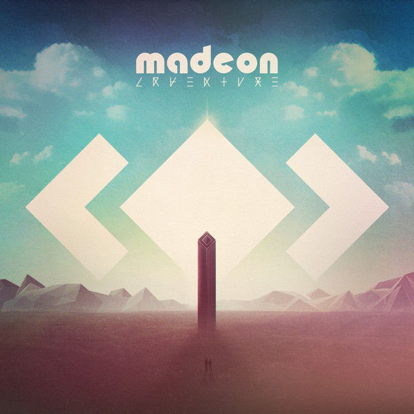
For some context about the Adventure album, Madeon always said that Adventure is a reflection of his teenage years. Each song serves a specific purpose and they all come together to create the story of Adventure. Knowing Madeon, even the order of the songs matter because some of the songs bleeds or continues into each other when you play them in order. It probably represents different aspects of his teenagehood and how he moved past them into his young adulthood. In the beginning tracks, Adventure gives a feeling of excitement since it was the start of his music career. Towards the end of the album it feels more emotional and reflective as his teenage years come to an end and he needed to grow up. I get a sense of overall optimism while listening to this album and it's fun electronic pop.
As for his logo, I believe that he designed it himself. He actually made his album art too since he likes to learn about anything creative and decided that he was going to learn how to make 3D art too (Like seriously? How talented and ambitious). The font he used for his first logo is BauHaus 93, which is a geometric sans-serif. It's bold, friendly, and experimental. Since it is a geometric sans-serif, the typeface itself is perfectly rounded and almost mathematical. That is also a great reflection of Madeon's music because he is very purposeful with each song that he produces.
This is what his new logo looks like along with the vinyl design for his single, "All My Friends":


Madeon did not make his new logo himself, but he did art direct it. The designer for his new logo is Cory Schmitz (Who is pretty much graphic design goals). It looks like the typeface they used is Elephant that is customized for the wave/fluid effect.
AS YOU CAN SEE, the two logos are very different! Madeon has been mentioning how Good Faith is a coming of age story, transitioning out of his teenage years.
His old logo was a bold and fun sans-serif in all lowercase letters, which felt young and innocent. His current logo is a condensed modern serif in all caps with the wave being a symbol of the transition that he is going through. Serif typefaces have a more serious and formal tone to it and I can already hear the difference in his music with his newest singles. I also noticed that in new logo that they added extra strokes of the M and N probably for legibility and balance of the logo. Hugo (Madeon) is growing up and maturing in his music :')
At first when his new graphics, I was perplexed on why he decided to go with such a sophisticated serif typeface. However after reading about what he has in store for Good Faith, it made a lot of sense on why he went with it. I have learned during my time of research that in order to understand Madeon and creative decisions, you need to know some context about him. The things that he puts out in the world is not straightforward and you often need to find your own interpretation.
Doing all of this research is also a reminder for myself that if I care about something, it's easy for me to be thirsty to learn more about it and let it consume me for a bit. Like, if I can spend all of this time doing research about Madeon and his creative process, I can definitely do this for other hobbies in my life. I did a similar thing for the show, Fleabag (which I also mentioned in my previous blog post hehe).
But all in all, I hope that my thirst for knowledge and my curiosity never goes away because it's what makes me a rather passionate individual and I never want to stop learning. If Madeon can learn how to make amazing electronic music, make his own visuals, art direct, AND learn English, I can definitely achieve great things too. I've developed a great respect for Madeon and I sincerely see him as a true artist. He has inspired me to get better at my craft and to create more things that I am passionate about.
Ah I'm so excited for what the rest of Good Faith! I'll just continue patiently waiting for the remainder of the album to drop.

Until next time my friend,
Amanda ^_^


Comments